Welcome to Single City
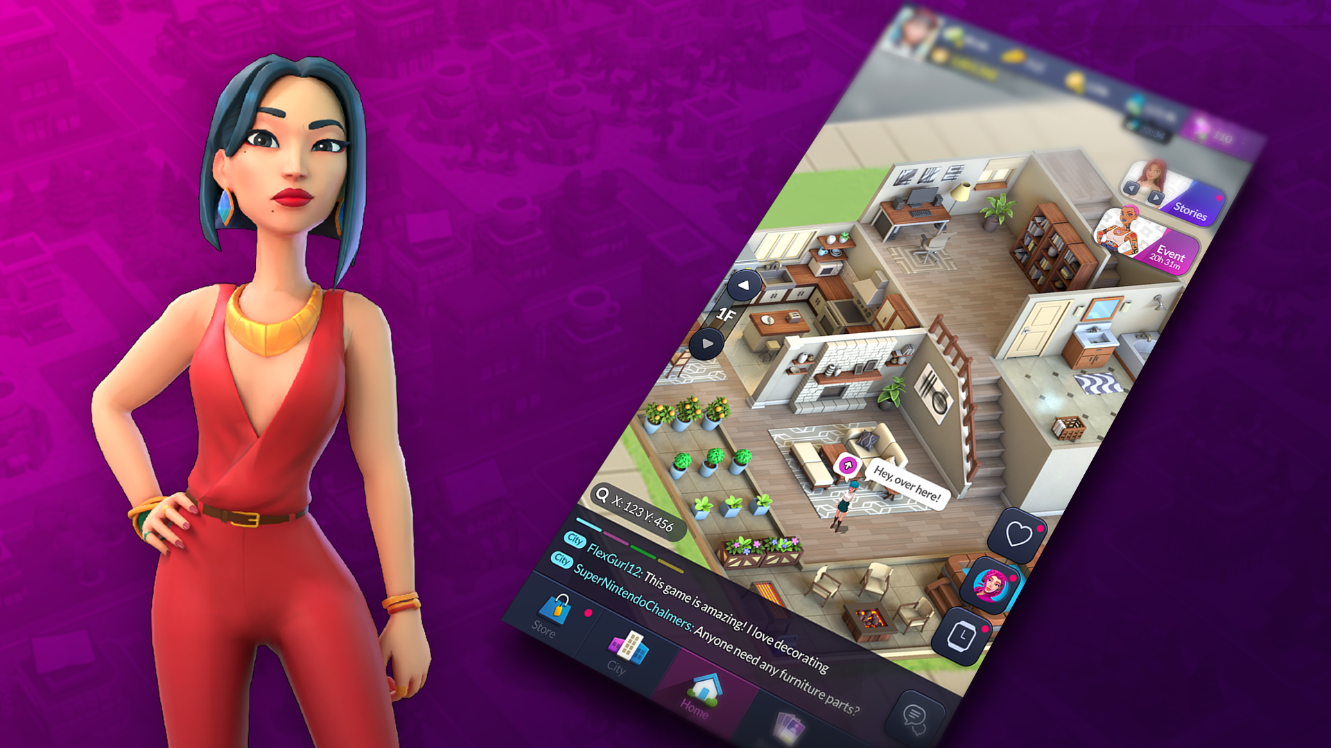
Single City is a unique strategy march game where fame is the ultimate goal. Flirt, flex, and flaunt your way through encounters in the big city, causing drama for your rivals while you gather followers. More friends and followers means more clout, which means more power!
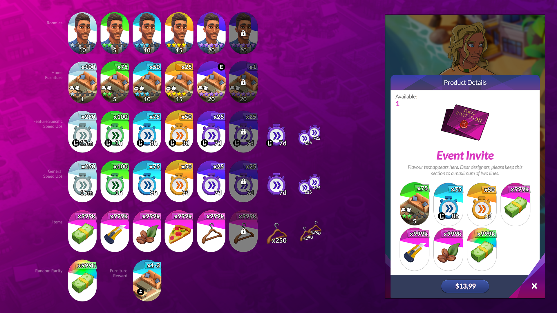
As the senior designer on the title I was responsible for setting the overall visual style of the game’s UI, wireframes, marketing, ASO (app store optimizations) and helping to implement assets into Unity. I worked closely with many game designers, artists and engineers.




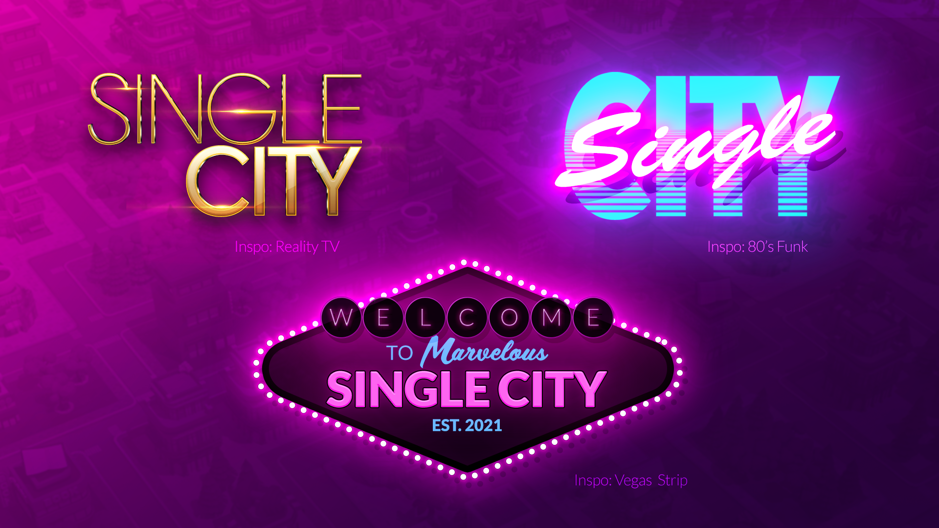
Single City’s tone went through multiple iterations. As a result, the game’s logo also saw some interesting variations of it’s own; from high-end, reality TV dramas to 80’s funk – below are a few of those concepts. In the end, we went with a more broadly appealing treatment that sought to target the core audience of 18 to 30-something’s.
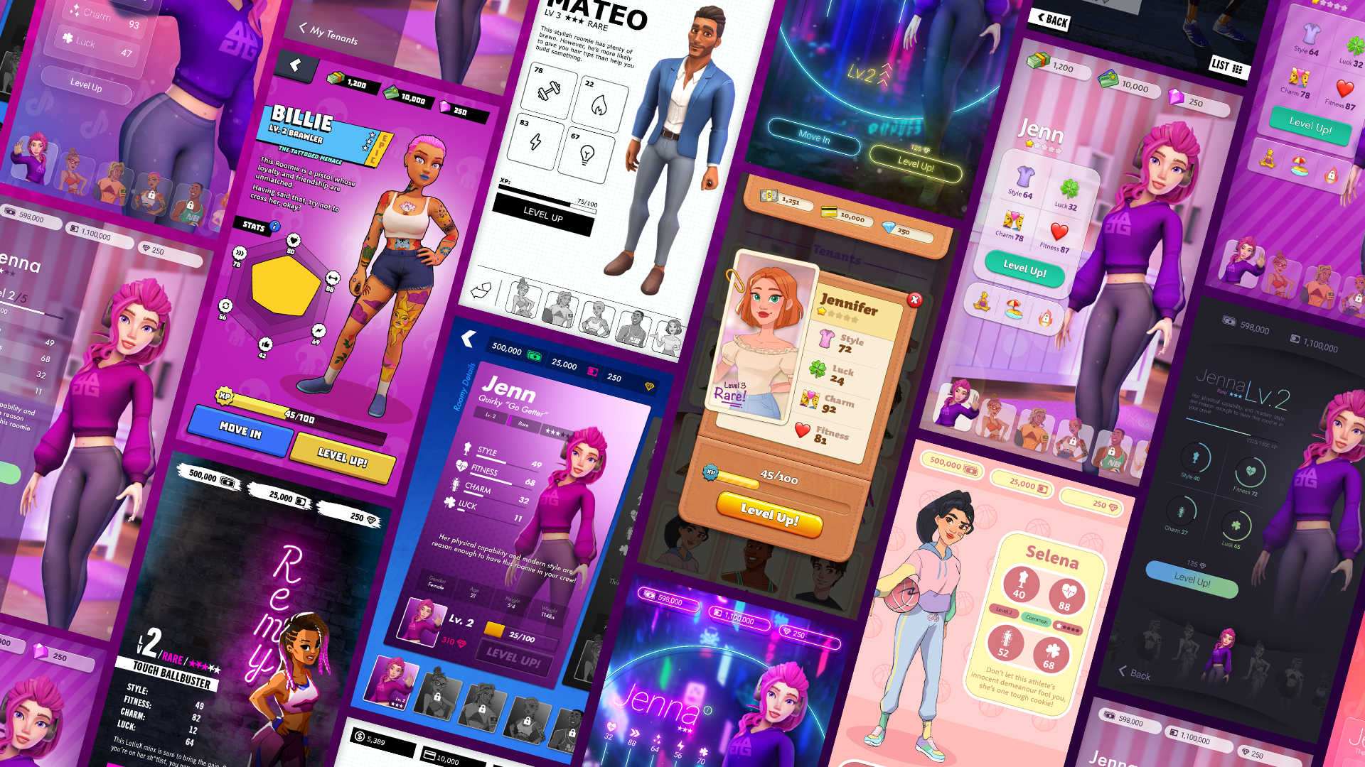
The game’s logo wasn’t the only thing that went through multiple iterations. The team’s UA department ran countless ad tests to best capture our target audience. To support this endeavour, I was tasked with taking the character profile screen and creating various UI’s that fell within the following four criteria in our quadrant diagram [+]; Modern to Playful on the y-axis and Flat to Rich on the x-axis. Ultimately, we ended up choosing a UI that fell close to the middle of those four quadrants as it had the best UA results.
We wanted Single City to feel like a vibrant, populated urban city filled with social media and brand name goods with which the denizens of Single City would lust after. To accomplish that we wove those elements into the narrative and I created faux brand visuals to pepper throughout the city; from billboards to phone apps.

